Don't Tell Me, Show Me: Govan HELP's new brand
James Anderson
Creative Director
The Marketing Department
Over the past few months, TMD has been working with Govan HELP to update the charity’s brand and create for them a shiny new website. This is the story of how Govan HELP’s new brand came to be.
If you’re familiar with Govan HELP, you’ll know that 2021 represents the charity’s 25th year of delivering life-changing family support programmes. Marking this significant achievement, Govan HELP’s Chief Officer Viv Sawers reached out to discuss the prospect of TMD building the charity a new website.
I jumped at the chance. My background is in community development, and TMD have been lucky to build websites for other fantastic charities in the past. We immediately set about drafting a proposal… only to come up against a problem.
The logo, as it then stood, wasn’t appropriate for digital use. A good design in its own right, and one that has done well for Govan HELP over many years, the logos of today are expected to be accessible across mediums and formats. We had to ask ourselves — Will this logo be readable on a smartwatch? Will it scale up to the size of a billboard?
Old Govan HELP Logo
We could quite happily build a website, but to centre it around the old brand mark seemed counter-productive. I expressed to Viv that I thought it was time for a change, and that TMD could design a logo that was more dynamic while staying true to the original. Viv was willing to listen, and after I had finished, she said something that stuck with me:
“Don’t tell me; show me.”
I was humbled. It’s rare that a client should put such trust in you from the outset, without the groundwork of branding workshops and long drawn-out discussions. I was also slightly terrified, conscious that any new brand could impact the success of the charity, and hence people’s livelihoods. After a lot of careful thought, I got to work.
The new brand needed to be appropriate for the digital age, and borrow the motifs that have characterised Govan HELP since its inception.
So I started with the hand. Not an abstract drawing, but an easily-identifiable human hand. For me, it represents the helping hand the charity provides to its service users, but also the idea of raising your hand when you need help — like in school, especially appropriate as much of Govan HELP’s work is with children.
New Govan HELP Logo
The shapes surrounding the hand evoke the idea of coming together around a shared cause. I wanted to use a range of bright colours here to symbolise the range of Govan HELP’s services and stakeholders. You’ll notice that the colours are on a gradient, getting lighter as they move outwards. Hence, the hand literally takes away the darkness.
Furthermore, we can incorporate relevant pictures into the logo to emphasise the idea of each colour/shape representing a service, and more importantly, centre the people that make Govan HELP.
Connecting Communities: service users making up the Govan HELP logo
The hand being in negative space is also a choice. It means the hand can belong to anyone — Govan is diverse, and the charity’s staff and service users are comprised of all ages, genders, races and ethnicities. This is all the more clear when the design is used on different backdrops.
Black and white brand variants.
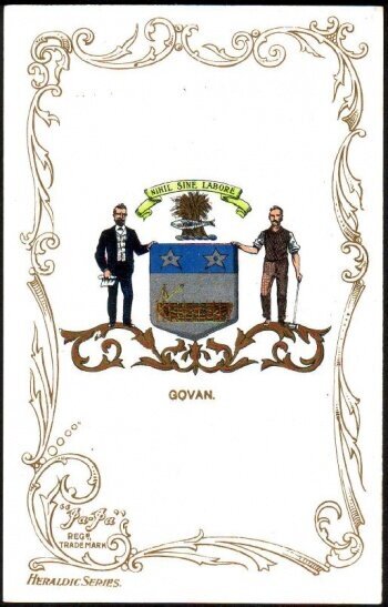
To finish off, I borrowed the blue and grey colours of the Govan coat of arms to make the brand mark text:
Govan Coat of Arms
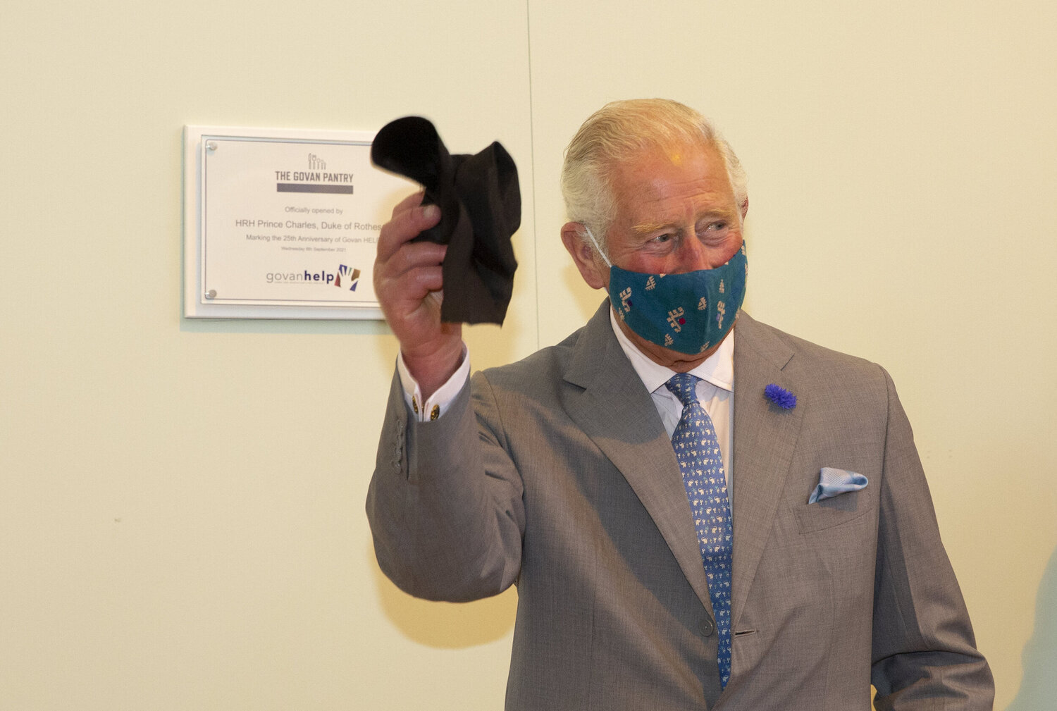
There you have it — an updated brand to take Govan HELP through the next 25 years, and beyond! Suffice to say, Viv loved what we had created, and the brand was officially launched in an unveiling ceremony featuring Prince Charles as guest of honour.
Thank you to all the team at Govan HELP for being patient and responsive throughout this process. Govan HELP continues to provide vital support services to children and parents in the greater Govan area. If you’re able, you can support their work by donating here.
HRH Prince Charles unveiling the new Govan HELP brand


