
The Dawn of a Brighter Future at Stepping Stones for Families

Louise Bennett (HR Manager), Isobel Lawson (CEO) and Mike Lofthouse (Finance Manager)
Today we celebrate the launch of a rebrand that has been six months in the making.
For nearly thirty years, Stepping Stones for Families has worked alongside children, young people and families to give them support, opportunities and a voice in tackling the effects of poverty and disadvantage in their lives. During nearly three decades being spent transforming lives, the work of the organisation was practically invisible outside of the sector. Inspiring Scotland - which helps essential charities to become extraordinary charities - wanted to help Stepping Stones for Families tell its story and offered funding to achieve this goal.
The Marketing Department was suggested by Inspiring Scotland and we met with Isobel and her team to discuss improving the charity's communications and social media presences. As we worked through the needs of Stepping Stones for Families, it became apparent that the website needed a refresh. Not only was it not mobile-compliant, it was based on an old platform and was difficult for staff to update.
It was soon after this we realised that there were usability and perception issues with the logo and visual appearance of Stepping Stones for Families. It didn't accurately reflect what the organisation does, its ethos or its purpose.
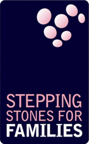
Logo 2000 - 2017
Isobel agreed that a full rebrand was needed and before long we declared to the entire Stepping Stones for Families team that:

One of the misconceptions about the old visual identity was around the circular blobs in the upper right hand side. When it was developed, the concept was that the blobs were thought bubbles. Over the years, this message was lost. Newer members of the team assumed they were meant to represent “stones” because the word “stones” is part of the charity’s name. Keen to move away from this confusion, we developed an entirely new visual concept that was more angular and introduced three main colours into the brand:


During our initial meetings with the Stepping Stones for Families team, we spent considerable time discussing the organisation’s history, its ethos, and its aspirations. It became obvious that the overall purpose and aim of the charity is to sustain positive change in the lives of the service users. This is why a new strapline has been introduced as part of the brand: Sustaining Positive Change.
The three triangles represent this and the two other pillars of the organisation:

Inspired by children’s playing blocks, the arrangement of the triangles themselves is a triangle. This suggests the idea of building and communicates an aspirational, colourful, growing and engaging charity.
In order to give the new visual identity a recurring motif that can be used to support the new logo, we developed three different types of polygon backgrounds, in each of the new brand colours.


These can be used on the front of reports, in hero images for social media headers etc.
One thing that jumped out during initial chats with the team was that a lack of a brand toolkit, brand master files and ready-made templates was creating a massive time drain on a number of services. Documents would be created from scratch for almost everything, and staff would face enormous frustration when using Microsoft Word due to its infamously confusing image positioning controls.
This situation was addressed by introducing a wide range of templates for staff across all sites to use. These were developed, signed off and rolled out to all staff in the weeks before the rebrand launch.

This meant everyone had a few weeks to update documents, forms and signage etc in the weeks before the launch. It also served another purpose - namely, to help everyone feel part of the rebrand.
What’s Next?
The Marketing Department will continue to work with the Stepping Stones for Families team to ensure the orderly use of the brand and to answer any questions that crop up when using the new brand assets and creating materials.
We’d also like to hear your thoughts on the rebrand! Get in touch.