Toonspeak
⬢ Branding
⬢ Website
⬢ E-commerce
⬢ Communications
⬢ Fundraising Campaign
Toonspeak is a youth-led theatre company based in Glasgow. A registered charity in its fourth decade, Toonspeak offers an accessible and high-quality programme of theatrical arts. Deeply embedded in Scotland’s creative community, the organisation works to fight elitism in the arts, and provides pathways for growth which support young people into employment and further education.
With Toonspeak’s continued growth – and collaborations with the likes of the National Theatre of Scotland and the Royal Conservatoire of Scotland – the organisation recognised a need to evolve its brand identity. They sought to position themselves as a “professional theatre company” first and a “youth charity” second, reflecting the high calibre of their work and the impact they have within Scotland’s arts scene. Additionally, they felt their existing visual identity skewed too youthful. Having previously worked with other Glasgow-based arts charities, such as Indepen-dance, we had the tools to assist Toonspeak with this pivot.
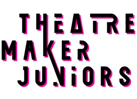
We began by workshopping Toonspeak’s visual branding with their team, exploring various design directions before settling on a completely revolutionised brandmark. This new logo was crafted using a custom font designed specifically for Toonspeak. The font draws inspiration from the Art Deco movement – a period known for its democratising impact on the arts, reflecting Toonspeak's mission to break down barriers. The custom font also incorporates dots and letter linkages that are reminiscent of the ‘Glasgow Style’ made famous by Charles Rennie Mackintosh, proudly emphasising the charity’s Glasgow roots.
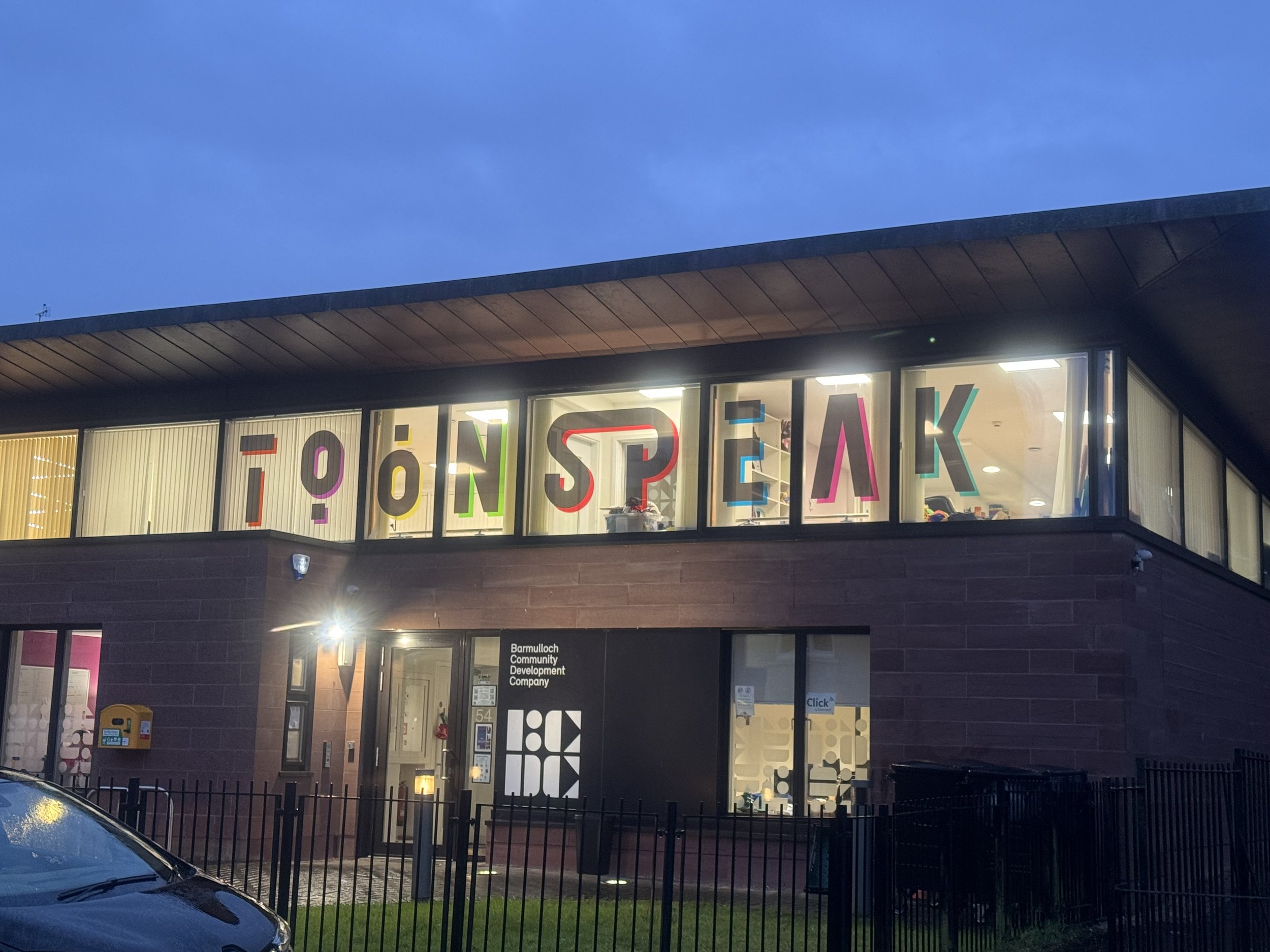
With a new brandmark in place, we extended this design language across Toonspeak’s various sub-brands, ensuring a cohesive visual identity throughout. We then collaborated with local printers to produce a range of branded materials – including roller banners, staff ID badges, lanyards, t-shirts, and a jumbo window decal at their Glasgow headquarters. To bring the charity’s online presence in line with the updated visual style, we also developed a brand-new Toonspeak website. The site features dynamic images and video content that showcase Toonspeak’s diverse opportunities for young people.
A rebrand is only as strong as the story it tells. Our final task was to work with Toonspeak’s team to refine how they talk about themselves, creating a core narrative that accurately conveys their mission. This narrative now serves as a guiding framework for all communications, ensuring that the rebrand extends beyond aesthetics into every interaction with stakeholders.
Bold, versatile and unique branding introduced
New style means greatly enhanced, consistent and impactful social media comms
Improved wayfinding and bold signage for greater brand visibility in the community


Throughout 2023 and 2024, Toonspeak has been going through a period of change as we acknowledge a new, post-pandemic era and work to develop a strategy that meets the needs of our young people, allowing them to form an integral part of our journey. The start of this new era highlighted the need for a well-overdue rebrand and website, which represent the young people and communities that we work with. The team at The Marketing Department have been brilliant to work with- taking time to appreciate our needs and requirements, including the input of our staff and young people where possible- often with (very!) short time frames to do it in. The outcome of our work with TMD has been a modern, vibrant, and dynamic rebrand and website, both of which are representative of the creative, youth-led organisation that we are. A bonus is that the team are highly skilled at what they do, and all-round lovely people too!
— Lisa Givens, Chief Executive, Toonspeak


