
PEEK
⬢ Branding
⬢ Communications planning
⬢ CRM & website Integration
⬢ Design
⬢ Digital strategy
⬢ Website
PEEK has been a trusted presence in Glasgow’s east end communities since the year 2000, their iconic red hoodies a symbol of care, creativity and collaboration. The charity helps to raise aspirations of children, young people and families, through play and wellbeing programmes delivered in partnership with local schools and organisations.
As PEEK's impact has grown, its visual identity has struggled to keep pace. The team felt their existing branding was inconsistent, particularly in digital spaces, while their website had become overloaded, with no real user journey or content strategy. They wanted to preserve their recognisable red colour scheme while creating a fresh, cohesive identity that would resonate with their young audience.
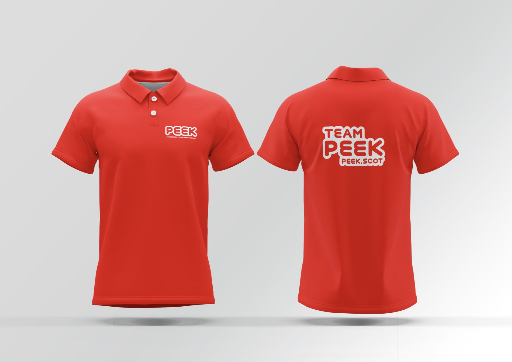
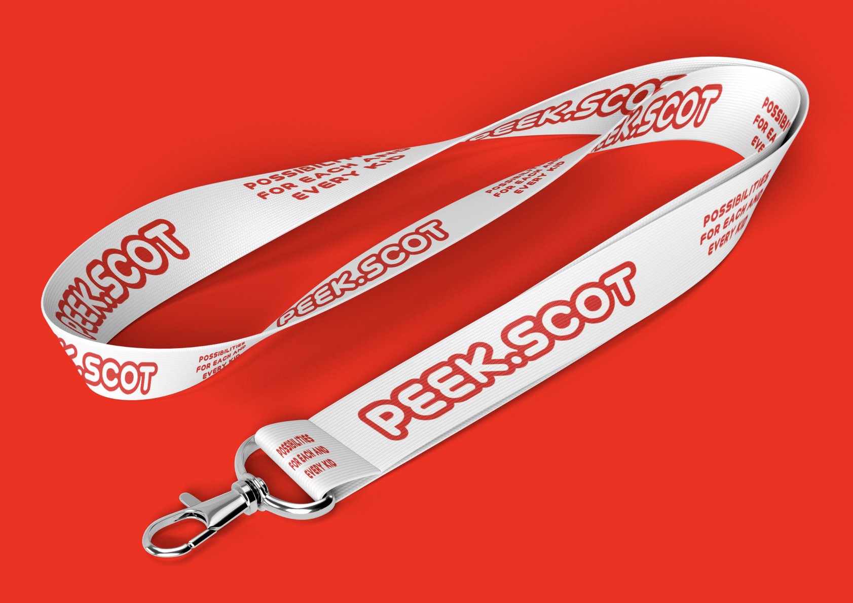
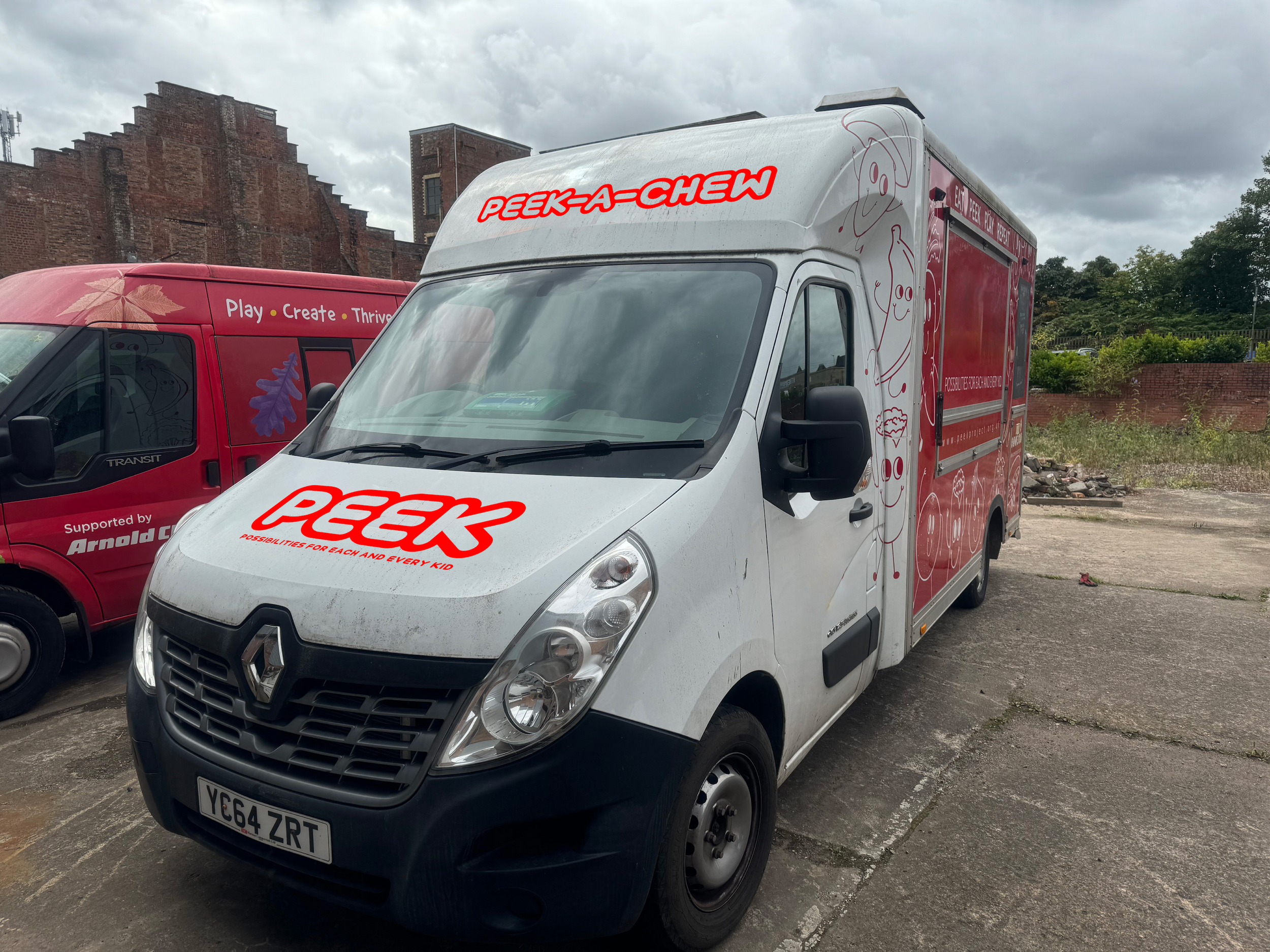
Our collaboration began with intensive workshops to understand PEEK's vision. The resulting brand identity features a warm, rounded brand mark that embodies community and connection, with custom new typeface called Peekify that reflects their inclusive, barrier-busting approach. This new visual language was then applied across all touchpoints – including roller banners, pens, lanyards, and of course, their red hoodies!
The rebrand included a complete website overhaul, featuring engaging video content that brings PEEK's work to life. We also developed clear tone of voice and brand guidelines to help the charity articulate their mission with consistency and impact. Overall, this transformation positions PEEK for continued growth, ensuring their visual identity matches the incredible work they do in Glasgow's communities.

Entirely new visual
language rolled out
across entire
organisation
New website is
the cornerstone of
PEEK’s fundraising
strategy
Greater data
efficiency with website/Salesforce integration