Rebranding the Moira Anderson Foundation

James Anderson
Creative Director
Moira Anderson was 11 years old when she vanished on February 23, 1957, after getting caught in a blizzard on her way to the shops. Moira has never been seen again. It is every family’s worst nightmare and Moira’s family were left to wonder and worry. It is likely she was abducted and murdered but she has never been found and the questions remain unanswered.
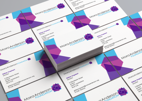
The Moira Anderson Foundation, based in North Lanarkshire, was launched in the year 2000 by Sandra Brown OBE, as a legacy to Moira Anderson and her family. It provides a place of safety and support for children and adults who have been affected by childhood sexual abuse.

Moira Anderson
Looking forward to February 2020 when the Foundation will mark their 20th anniversary, as well as running a fundraising campaign to expand their services, it was agreed now was the time to give the Foundation a new visual identity, building on the legacy of what they have achieved.

MAF brandmark 2000-2019
It’s been an incredibly rewarding experience working with the Moira Anderson Foundation, to play a small part in the wider picture of the service they provide, but it was also a very challenging one. Given the nature of the Foundation, it was vital to understand their work:
Why they do what they do
Who they support
What is their full service offering?
What are their values and principles?
How do they ultimately tackle Childhood Sexual Abuse together?
Gillian Urquhart, Director of the Moira Anderson Foundation, was invaluable when understanding all of this. Her commitment and insight is second to none and it helped me to truly appreciate and understand the importance of such an organisation. I realised how crucial it was to treat this rebrand with the greatest of sensitivity, to design a new brand that captures what the Foundation represents today while acknowledging where it has come from, and to create a visual style that will work both digitally and in print as the Foundation moves into the next 20 years.

Taking the hand from the old brand as the departure point, I began to think bout what children do with their hands. They play, create, touch, and seek comfort. I wanted the new brand to express this childhood innocence as well as being strong and present. I thought of the child’s toy of putting blocks through corresponding shapes and this relates directly to a “square peg in a round hold,” the idea of not fitting in or feeling out of place. I wanted to bring these shapes to life and have them represent the Foundation. Three shapes plus the hand are layered on top of one another representing the 4 values of the Moira Anderson Foundation.
INTEGRITY

The square represents integrity. It reflects the safe space where the services take place. In colour psychology, blue is the colour of peace.
RESILIENCE

The hexagon represents resilience. As well as the multi-faceted approach the Foundation takes to it’s work, the love of many parents, friends and relatives supports those affected to be more resilient. In colour psychology, magenta represents harmony and emotional balance.
TRUST

The triangle represents trust, the 3 way relationship between the Foundation, their support staff and their service users. Purple is the colour used to represent Childhood Sexual Abuse. In colour psychology, purple represents imagination and creativity.
COMPASSION

The hand of a child represents compassion as well as Moira Anderson and the Foundation itself. It is physical, emotional and tangible and provides comfort and support when needed.
The shapes have an opacity and are layered in the brand mark. As the colours overlap, additional shapes are created. This reflects the Foundation and it’s approach. Each time they provide support to a new individual they create a bespoke, needs-led service for that person. When the shapes are used for additional graphics, they are overlapped in different ways to reflect this bespoke nature.


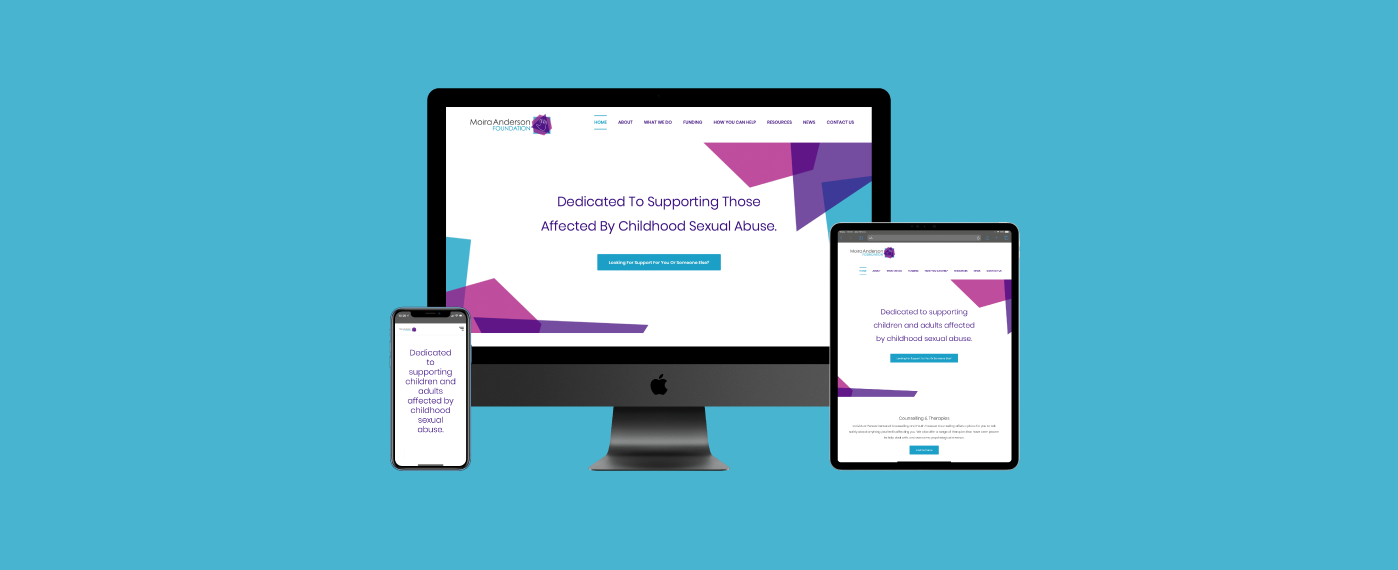
Before our involvement in this project, the Moira Anderson Foundation had already appointed a web development agency Speed of Light to create a new website for the Foundation. We worked very closely Speed of Light to ensure the new site adopted the new brand as well as creating a lot of content and bespoke imagery for the new site.
As the Moira Anderson Foundation looks to the next 20 years, they have a funding target to meet in order to continue to grow their services. If you feel able to donate to this much-needed, invaluable organisation then please donate here. If you wish to keep up-to-date with the work of the Foundation, you can follow them on Facebook and Twitter.